Pimp your maps!

Have you ever been fascinated by the handsomeness of a map? I have to admit, for a large majority (some of my friends would disagree 👀), looking at classical statistical charts is hardly touching. However, add in a spatial dimension and it often becomes much more interesting, I would even say exciting!
The main goal of this post, as one would have probably guessed reading the title, is to share with you some tricks to pimp your interactive maps created with giving them a more professional look.
Data
Different examples throughout this post illustrate the median total income of households in 2015 for the census division of Quebec. This data is open sourced and available on Statistics Canada’s website. As specifically treating census profile data is not in the intended scope of this post, I have produced the excerpt of data needed to run the examples in a ready-to-use tidy format. You can easily download it by clicking here.
The included files are:
ada_qc.shp: Boundaries of aggregated dissemination areas,da_qc.shp: Boundaries of dissemination areas,hydro_qc.shp: Hydrographic boundaries, andmedincome_qc.csvy: Median total income of households in 2015.
First we load these files in our R session. As you will see in the following code bloc, we’ll use the data.table
package to manage in-memory data. Spatial columns will be of sfc class as defined in the sf package. Please note that
there would be other ways to achieve the same result such as directly using an sf class object. As a matter of fact, the suggested workflow is nothing more
than a personal preference (but let’s face it, data.table is probably the best thing since sliced bread).
# Loading packages
library(data.table)
library(sf)

# Reading spatial layers
ada_qc <- read_sf("data/ada_qc.shp") %>% setDT()
da_qc <- read_sf("data/da_qc.shp") %>% setDT()
hydro_qc <- read_sf("data/hydro_qc.shp") %>% setDT()

# Reading median total income of households data
medincome_qc <- fread("data/medincome_qc.csvy", yaml = TRUE)
We then give a look at the ada_qc and medincome_qc objects.
ada_qc[]
#>       ADAUID geometry
#>  1: 24230032  <XY[1]>
#>  2: 24230029  <XY[1]>
#>  3: 24230030  <XY[1]>
#>  4: 24230031  <XY[1]>
#>  5: 24230001  <XY[1]>
#> ---
#> 66: 24230070  <XY[1]>
#> 67: 24230071  <XY[1]>
#> 68: 24230072  <XY[1]>
#> 69: 24230073  <XY[1]>
#> 70: 24230074  <XY[1]>

medincome_qc[]
#>       type       id med_income
#>    1:  ada 24230001      94687
#>    2:  ada 24230003      75898
#>    3:  ada 24230004      77845
#>    4:  ada 24230005      79467
#>    5:  ada 24230007      57568
#>   ---
#> 1268:   da 24250312     131190
#> 1269:   da 24250313     130816
#> 1270:   da 24250314     108800
#> 1271:   da 24250315      84890
#> 1272:   da 24250316      99226
For being able to create our map, we’ll have to combine the spatial and the tabular data together in a single table. We’ll perform this using the
data.table merge by-reference syntax. We then print the result.
# Merging data
ada_qc[medincome_qc[type == "ada"], med_income := med_income, on = c(ADAUID = "id")]
da_qc[medincome_qc[type == "da"], med_income := med_income, on = c(DAUID = "id")]

# Printing ada_qc
ada_qc[]
#>       ADAUID geometry med_income
#>  1: 24230032  <XY[1]>      40749
#>  2: 24230029  <XY[1]>      64922
#>  3: 24230030  <XY[1]>      66641
#>  4: 24230031  <XY[1]>      47381
#>  5: 24230001  <XY[1]>      94687
#> ---
#> 66: 24230070  <XY[1]>      50667
#> 67: 24230071  <XY[1]>      95604
#> 68: 24230072  <XY[1]>     106445
#> 69: 24230073  <XY[1]>      53902
#> 70: 24230074  <XY[1]>      64329
We now have in hands everything we need to ba able to produce a map of the median total income of households in 2015 for every aggregated dissemination areas of the census division of Quebec 🥳.
Basic map
Before learning how to pimp a map, one needs to be able to produce a basic one. We’ll use the leaflet package for this
purpose. I strongly suggest to read the package’s documentation to understand the different functions and their respective arguments.
The only point on which I want to add something is the value of the data argument of the addPolygons() function. As one will see, I transformed the
data.table object in an sf one (using the st_as_sf() function) and I reprojected it in longitude/latitude (using the st_transform() function). These
additional steps are required for an easy integration with leaflet.
# Loading package
library(leaflet)

# Creating a basic interactive map
leaflet(
  width = "100%"
) %>%
  addTiles() %>%
  addPolygons(
    data = ada_qc %>% st_as_sf() %>% st_transform(4326L),
    weight = 1L,
    color = gray(0.3),
    opacity = 1,
    fillColor = ~colorNumeric(
      palette = "Greens",
      domain = range(med_income)
    )(med_income),
    fillOpacity = 0.5
  )
Sure, this map shows exactly what we were looking for. But bear with me, because I’m going to show you how simple tweaks could easily help you improve it.

Suggested improvements
Any of the following suggested improvements can be included on a standalone basis in an interactive map. Depending on the situation, some will have a better fit than others, there is no one-size-fits-all recipe. Each of them will be presented successively and then a pimped map regrouping all of them will be produced in the next section.
Background tiles
In the basic example, we kept the default behaviour of the addTiles() function, using the OSM background tiles. Those tiles are meant to be comprehensive,
thus containing a lot of informations. Most of the time, it’s just too much 😖. My advice would be to judiciously choose the background
tiles you use making sure to keep the emphasis on what you really intended to illustrate. You can launch
this interactive application to easily compare the natively available tiles included with
leaflet. Personally, I most often use Positron and DarkMatter provided by CartoDB.
Another possible improvement concerning tiles would be to divide the actual background and the labels into two specific layers. Take a look back at the map in the previous section and you will see how the labels get blurred when hidden below the polygons, making them difficult to read. This problem will only grow higher with the polygon’s opacity increasing. The workaround to fix this is to print the land tiles on the background layer, the labels on the top layer, and the polygons as the meat in the sandwich.

To make this possible, we’ll create three different panes with the addMapPane() function. The depth of each layer will be defined by the zIndex argument, a
higher one meaning that the layer will lean closer to the top.
Scale’s range
Until now, we didn’t ask ourselves any question about the color scale used in the map. One could probably deduce that we specified we wanted green tones by
letting the palette argument taking the value "Greens" 🤑. The most insightful readers may have notice that we specified we
wanted the domain to be the full range of values of the variable of interest. Indeed, in the basic map the scale is linear from the minimal value of median
total income of households ($35,523) to its maximum
($144,981).
Of course, this scale is not always necessarily the best fit. Below, we plot the distribution of median total income of households by aggregated dissemination
areas using the ggplot2 package. We also attach the scales package (already charged with
ggplot2, but not attached) in order to specify the numerical format to use.
# Loading packages
library(ggplot2)
library(scales)

# Ploting the histogram
ggplot(
  data = ada_qc,
  mapping = aes(
    x = med_income
  )
) +
  geom_bar() +
  scale_x_binned(
    labels = label_number(
      big.mark = ","
    )
  ) +
  labs(
    x = "Median total income of households in 2015 ($)",
    y = "Number of aggregated dissemination areas",
    caption = "Census division of Quebec"
  ) +
  theme_minimal()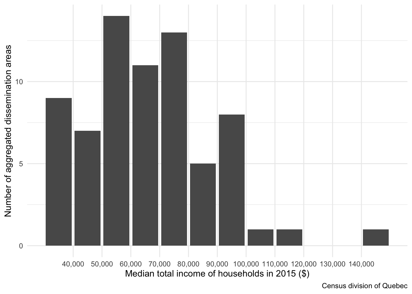
By looking at this histogram, we can assume that a domain from $30,000 to $100,000 would probably improve the contrasts on the map, giving thereby a more
interesting result. Values outside of this range will be forced to its boundaries using the squish() fonction.
# Inputing the selected range
med_income_domain <- c(30L, 100L) * 1000L
Mouse events
Another suggested improvement would be to add mouse events when interacting with the map. You could personalize several of them, but let’s concentrate on
highlighting a polygon and showing up a label when the mouse drag over it. The argument highlightOptions of the addPolygons() function will be used for
adding the highlighting effect while both the label and labelOptions arguments will be for the interactive labels.
For creating an interesting highlighting effect, we’ll increase the filling opacity, and darken and thicken the polyong borders. We will specify the labels using simple strings in the example. If one would like to have a more advanced control, one could instead provide the html code to render. I encourage the most experimented readers (or the most geeky 🤓) to give it a try!
Cutting the water system
This suggested improvement is sometimes interesting, sometimes not, depending of the use case. As suggested by the subsection header, we’ll be cutting the water system from our polygon layer.
We first create a spatial object representing the union of all rivers and lakes located in the target region using the st_union() function. Afterwards, we’ll
cut the polygons using the st_difference() function.
# Creating hydro_qc_union
hydro_qc_union <- hydro_qc[, st_union(geometry)]

# Cutting the polygons
ada_qc[, geometry_nohydro := st_difference(geometry, hydro_qc_union)]
da_qc[, geometry_nohydro := st_difference(geometry, hydro_qc_union)]
Dynamic accuracy
The last but not the least improvement would be to allow for dynamic accuracy on the map depending on the actual zoom level. As you zoom in on the map, smaller and more accurate polygons will be automatically displayed. We’ll incorporate the following dynamic accuracy in the example:
- Zoom level between 10 and 12: aggregated dissemination areas,
- Zoom level between 13 and 15: dissemination areas.
To avoid copying and pasting the addPolygons() function and its numerous arguments, we will define the addMedIncomePolygons() function. It will set the
constant arguments between all polygon layers.
# Defining the addMedIncomePolygons() function
addMedIncomePolygons <- function(map, data, group) {
  addPolygons(
    map = map,
    data = data %>% st_as_sf(sf_column_name = "geometry_nohydro") %>% st_transform(4326L),
    group = group,
    weight = 1L,
    color = gray(0.3),
    opacity = 1,
    fillColor = ~colorNumeric(
      palette = "Greens",
      domain = med_income_domain
    )(squish(med_income, med_income_domain)),
    fillOpacity = 0.5,
    highlightOptions = highlightOptions(
      weight = 3,
      color = "black",
      fillOpacity = 0.7,
      bringToFront = TRUE
    ),
    label = ~dollar(med_income),
    labelOptions = labelOptions(
      direction = "top",
      offset = c(0, -5)
    ),
    options = pathOptions(
      pane = "med_income"
    )
  )
}
Putting it all together
By combining all the suggested improvements presented in the last section, we can now produce the pimped map below.
# Produce a pimped map
leaflet(
  width = "100%",
  options = leafletOptions(
    minZoom = 10L,
    maxZoom = 15L
  )
) %>%
  addMapPane(
    name = "background",
    zIndex = 100L
  ) %>%
  addMapPane(
    name = "med_income",
    zIndex = 400L
  ) %>%
  addMapPane(
    name = "labels",
    zIndex = 500L
  ) %>%
  addProviderTiles(
    provider = providers$CartoDB.PositronNoLabels,
    options = pathOptions(
      pane = "background"
    )
  ) %>%
  addProviderTiles(
    provider = providers$CartoDB.PositronOnlyLabels,
    options = pathOptions(
      pane = "labels"
    )
  ) %>%
  addMedIncomePolygons(ada_qc, "ada") %>%
  addMedIncomePolygons(da_qc, "da") %>%
  groupOptions("ada", 10:12) %>%
  groupOptions("da", 13:15)
Much better, isn’t it?

Conclusion
It’s been a long time now that I had in mind to create and feed a data science blog. For good or bad reasons, I’ve always find myself putting this project on hold. I must say that I’m now really satisfied being finaly able to complete this first step 😃.
The topic of my very first post was an easy one to choose from since some of my colleagues already asked me to write something that would help them improve their interactive maps in . I hope you enjoyed it, and above all that it will prove useful to some of you at one point.
If you have any ideas for other topics on which you would like to read me, please let me know and I’ll try to write out something interesting 🤗!
J.P. Le Cavalier
Data Scientist / Actuary
I consider myself as a hybrid between an actuary and a data scientist. I like to make things the right way.